3 thoughts on “I listened to your critique! Do you will have different suggestions?”
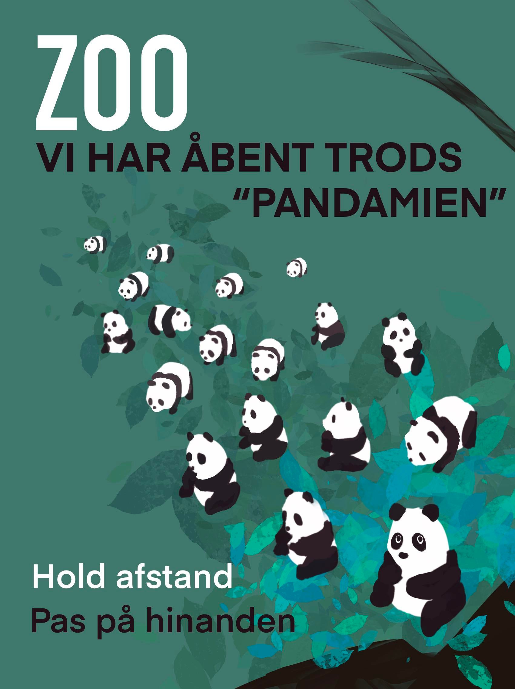
I like this a lot! The color scheme is great and the new additions to the background make the spacing of the pandas look more deliberate than random.
Two things that bother me though:
1. The black shape in the bottom right corner doesn’t really add anything to the design and it’s distracting, I would probably remove it.
2. Some of the elements clash in style. The bamboo in the corner is different than the pandas which are different than the leaves. I think you could remove the bamboo; I think the leaves and pandas look great together.
Great layout and nice colors – messages stands out ok – good choice of fonts etc. – but – the central attraction – the pandas – seem truncated somehow – and maybe a little off scale. Maybe fewer and larger would work better – just a thought. Overall – nice job.
I like this a lot! The color scheme is great and the new additions to the background make the spacing of the pandas look more deliberate than random.
Two things that bother me though:
1. The black shape in the bottom right corner doesn’t really add anything to the design and it’s distracting, I would probably remove it.
2. Some of the elements clash in style. The bamboo in the corner is different than the pandas which are different than the leaves. I think you could remove the bamboo; I think the leaves and pandas look great together.
Hope this helps!
For reference it says “we are open in spite of the “pandamic””. “Keep distance”. “Take care of each other”
Great layout and nice colors – messages stands out ok – good choice of fonts etc. – but – the central attraction – the pandas – seem truncated somehow – and maybe a little off scale. Maybe fewer and larger would work better – just a thought. Overall – nice job.