More than eighty percent of our ocean is unexplored. The vast open ocean has always fascinated and made me uncomfortable. I wanted to create a poster that captured that feeling.
As someone who suffers from thalassaphobia I can tell you this doesn’t trigger me. What triggers my phobia is showing how it is so deep that you can’t see the bottom once you break the surface.
Your work is well done though! I love the effect, the layout, and the font.
I’m just saying that if your goal was to trigger my phobia I would show what is beneath the surface also known as the terrifying expansive void that is home to all forms of life including undiscovered monsters.
Simulation and water color look great. Neat idea and pretty good font and layout, I think these will be a lot more effective the more cards you make. I want to see several of them in a group.
One thing I might suggest is try putting a subtle transparent dark gradient coming up from the bottom under your text, as it is it’s tricky to read with the water moving behind it.
You’ve completely invoked the feeling of this! I wonder what it would look like horizontal? That way you could play a bit more with the kerning and increase the font size.
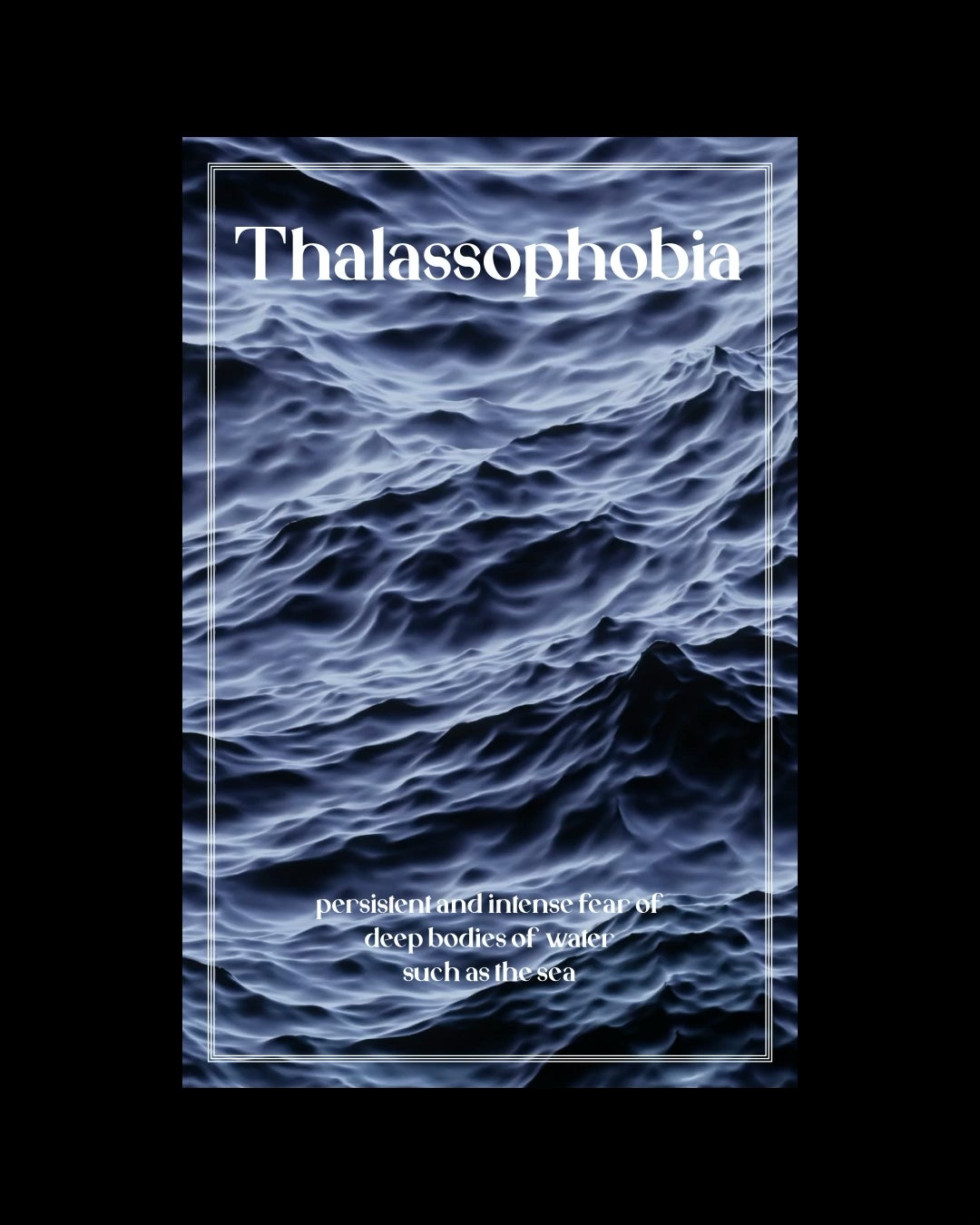
very rad. I’ve been very interested in the idea of moving posters like this lately. is the water real? it almost looks generated. great stuff!
More than eighty percent of our ocean is unexplored. The vast open ocean has always fascinated and made me uncomfortable. I wanted to create a poster that captured that feeling.
As someone who suffers from thalassaphobia I can tell you this doesn’t trigger me. What triggers my phobia is showing how it is so deep that you can’t see the bottom once you break the surface.
Your work is well done though! I love the effect, the layout, and the font.
I’m just saying that if your goal was to trigger my phobia I would show what is beneath the surface also known as the terrifying expansive void that is home to all forms of life including undiscovered monsters.
wow very cool. what font did you use?
Thanks for the chills
Simulation and water color look great. Neat idea and pretty good font and layout, I think these will be a lot more effective the more cards you make. I want to see several of them in a group.
One thing I might suggest is try putting a subtle transparent dark gradient coming up from the bottom under your text, as it is it’s tricky to read with the water moving behind it.
You’ve completely invoked the feeling of this! I wonder what it would look like horizontal? That way you could play a bit more with the kerning and increase the font size.
r/thalassophobia
Would you let me download this in hight quality? Would love this as a wallpaper
As someone who suffers from this I find it unsettling… show more of than gradient to darkness would make it terrifying.
NICE
I absolutely love this!!! This is a great example of forward thinking and creativity. Beautiful 🙂
My only problem is mentioned above with the light text at the bottom.
Hauntingly beautiful work, OP! Would you consider doing the same for Submechanophobia?
very cool
Kinda hard to read
Cool cool! Will this be a series?
Yup I got that
Alas-yee-phobia
This speaks to me. As someone with thalassophobia.
This gives me anxiety and I don’t even have thalassophobia lmao
as someone with thalassophobia this gives me the creeps, so i guess you did a great job 😉
Great work, but I would highly recommend not centering your small paragraph.
Maybe have like a hand of a statue occasionally show through the waves.