“What should we put on the bags, Steve?”
“Why, our social media or course, Dave.”
“Our facebook page, twitter name you mean?
“ALL OF IT, DAVE. ALL OF IT! (Maniacal laugh)”
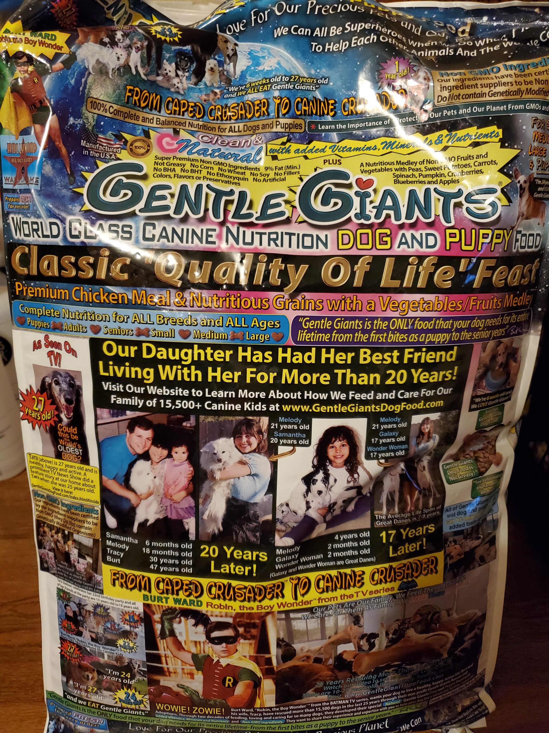
That “Disney” font combine with digital type font + 3D gold effect in Myriad font, surrounded by really messy layouts. Thats massacre of design. Whoever design this is probably a genius psycopath.
At this point I can honestly see the intention of the brand. And I gotta say, while it is chaotic, these designs are all legible, balanced and have clear hierarchy. It takes skill to design a mess this well.

Not a fan, but it is the kind of packaging that stands out between all the other high gloss, super fancy designed bags
graphic design is my passion
This is awful and all, but you design for the market, and this is probably very effective. I’m going with the designer being a evil genius.
The “WOWIE! ZOWIE!” had me 💀💀💀 wowza!
For what it’s worth, I instantly recognized this as Burt Ward’s dog food brand. It’s… memorable design, that’s for sure 🤷♂️
I love this!!! On the can it looked just like someone didn’t know how to design but here it works well!
Have you read everything on the bag? Is it all legitimate content, or did they slip a Loren Ipsum line anywhere for filler?
I mean, if a client asked me to put this much information in a packaging, I couldn’t do as good as that
“What should we put on the bags, Steve?”
“Why, our social media or course, Dave.”
“Our facebook page, twitter name you mean?
“ALL OF IT, DAVE. ALL OF IT! (Maniacal laugh)”
And Robin from Batman.
man this is a visual representation of ADHD if ive ever seen one
i love this. not everything needs to look conventional
Okay, now this is just free advertisement for an incredibly dubious ‘rescue.’
this is giving me a headache. i am in love with it
True insanity. Looks like the ad page on the free neighborhood newspaper that everyone leaves in the gutter or the bottom of their parakeet cage.
It may be good product in their but I’m not sure I or my dog could stand that bag screaming at us every day, lol!
Horror Vacui – the fear of white space
I think this designer is a genius. They managed to break every design rule while also creating something that I can’t look away from. A+
That “Disney” font combine with digital type font + 3D gold effect in Myriad font, surrounded by really messy layouts. Thats massacre of design. Whoever design this is probably a genius psycopath.
Hold up a minute, this stuff is owned by Burt Ward? The fuck??
Dr. Bronner’s of dog food
It looks like it’s made out of pages from the national enquirer
Please can we track down whoever did this… the AMA would be epic!
That’s a time consuming job 😅
Is someone gonna count the fonts?
It’s the Dr. Bronner’s of dog food!
Love the hierarchy of information. Read everything at the same time. Continue reading into the next week as it’s still burnt on your retina! 😝
I think it’s the Disney font for me
Anyone notice this is Burt Ward from the 60s Batman TV show?
Its like Dr. Bronner’s, but in color!
It’s like the Dr. Bronner’s of dog food.
Y’all, [their website](http://www.gentlegiantsrescue.com/) is 90s internet gold.
Every time I try to watch a movie on a free movie site
At this point I can honestly see the intention of the brand. And I gotta say, while it is chaotic, these designs are all legible, balanced and have clear hierarchy. It takes skill to design a mess this well.
It works. 😂😂 and I think it’s more difficult to do this packaging then actually creating a “conventional” one.
This is cool as hell. I’ve never spent 5 full minutes reading a dog food bag.
Art.
Lol @ the Disney font.
Isn’t this Burt Ward’s company? The guy who played Robin in the 60’s Batman show?
There are like 100 different fonts on this. My head hurts.
This is what drugs does when you’re designing… everything…
Second time I’ve seen this (only on the net). Is this some decently healthy dog food? Is it affordable? Is it recommended?